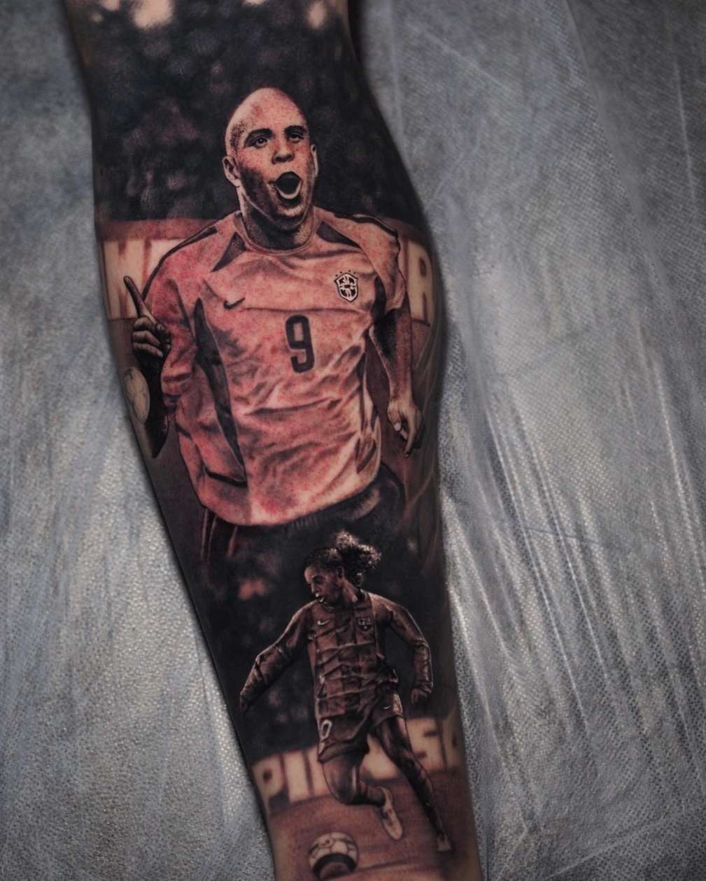
Realism tattooing divides into two distinct technical disciplines: black and grey work, which renders subjects through a controlled monochrome tonal range, and colour realism, which reproduces the full spectrum of colour in photographic or hyperrealistic detail. Both produce exceptional work in the right hands. Both attract serious clients and support premium pricing.
But for an aspiring realism artist choosing where to start, the question of which discipline to study first is worth answering carefully. Here’s a thorough comparison — and the case for a clear answer.
The Technical Differences
The foundational difference between the two styles is the number of variables the artist must manage simultaneously.
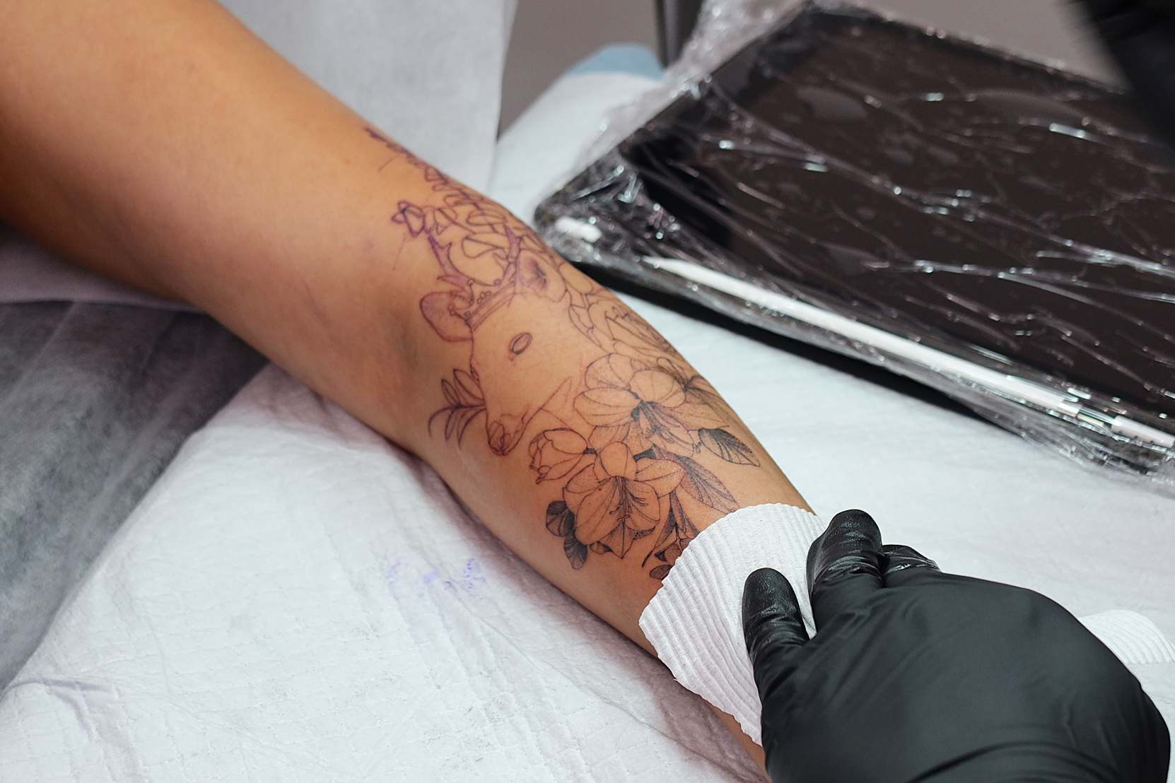
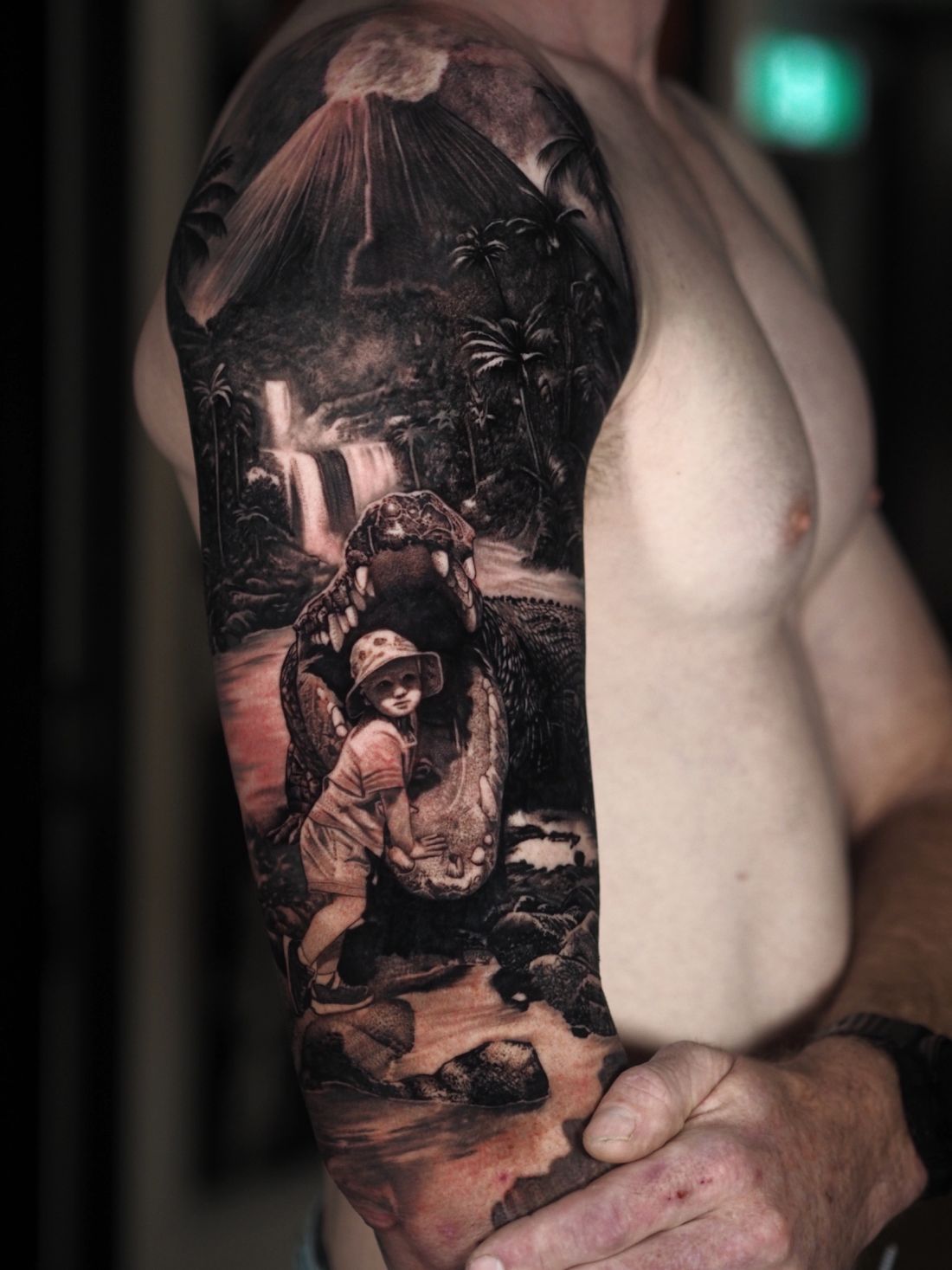
Black and grey realism involves one primary variable: value — the light-to-dark tonal range. The artist manages this range using black ink diluted with distilled water to various grey tones. Every decision — which needle, which dilution, how many passes — relates to a single dimension: getting the tonal values right.
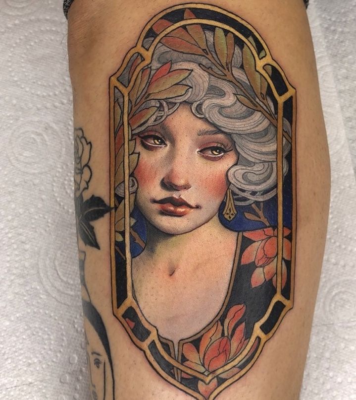
Colour realism adds the entire dimension of hue and colour temperature on top of that same tonal management. A colour portrait doesn’t just need accurate values — it needs those values expressed in the correct colour. Flesh tones require careful layering of reds, oranges, yellows, and browns. Shadows carry colour temperature — blue-purple in cool ambient light, warm ochre in warm light. Environmental colour — reflected colour from surrounding objects and surfaces — must be observed and translated. In short: black and grey is technically demanding. Colour realism is technically demanding plus significantly more complex.
Why Black and Grey Comes First
The logic is clear and consistent with how the industry’s best colour realism artists developed their skills. If you cannot translate a reference photograph into accurate tonal values in greyscale, you cannot do it accurately in colour — you’ll have the hue partially right while the underlying value structure is wrong, producing colour work that looks flat and lacks the three-dimensional quality that defines the style.
Black and grey realism forces you to develop the core competencies of realism in their purest, most isolated form: reading tonal values from reference, managing ink dilution, building shading through controlled layers, producing smooth transitions without overworking. These skills transfer directly into colour work — you’re adding colour knowledge on top of a solid foundation, rather than attempting to learn tonal management and colour management simultaneously.
Artists who attempt colour realism without a black and grey foundation commonly produce work where the colour knowledge is present but the tonal structure underneath is weak — colours sit flat on the skin without dimension, regardless of how accurately they’ve selected the right pigments.

Where Colour Realism Has Distinct Advantages
Once the foundation is in place, colour realism opens significant additional possibilities:
Subject range: Some subjects simply require colour to be fully convincing — tropical birds, vivid flowers, sunset landscapes, certain wildlife where distinctive colouration is part of the subject’s identity. Black and grey can approximate these subjects; colour realism can render them with a fidelity that is genuinely beyond what monochrome can achieve.
Client demand: A consistent market exists for high-quality colour realism in Canadian studios — particularly for pet portraits (where the specific markings and colouration of a beloved animal are what clients want captured), vibrant nature scenes, and complex fantasy compositions.
Premium positioning: Colour realism work is time-intensive and technically demanding to execute well. Pricing reflects this. Large-scale colour realism pieces from established artists command some of the highest per-session rates in any Canadian market.
Technical Challenges Specific to Colour Realism
Colour saturation on skin: Coloured inks behave differently from black on skin. Lighter colours fade faster than dark pigments. Some colour families — particularly yellow and white — have notoriously poor longevity. Understanding which pigments hold well and how to layer colours to achieve saturation without overworking the skin is a specific competency that adds to the already substantial demands of the discipline.
Colour temperature management: Real-world subjects don’t have one flat colour across their surface — they have colour temperature shifts driven by ambient light, reflected surfaces, and sub-surface variation. Accurately translating this colour complexity requires an eye trained in colour theory on top of the tonal management skills already demanded by realism.
Pigment interaction: Layering coloured inks can produce unexpected results when pigments interact with each other or with the skin’s underlying tone. This adds another layer of technical knowledge that doesn’t exist in black and grey work at all.
Our Recommendation: Start with Black and Grey
For the vast majority of aspiring realism artists — particularly those without an existing background in fine arts colour theory — starting with black and grey training produces the strongest long-term outcomes. The learning curve is steep but more manageable. The skills transfer directly. And the foundational discipline of getting tonal values right in monochrome is the single best preparation for getting them right in colour. Many of Canada’s finest colour realism artists describe their black and grey years as the most formative of their career — not because they intended to stay there, but because the discipline developed in monochrome made everything that came after significantly more achievable.