This comprehensive guide explores essential colour theory principles specifically for tattoo artists, covering the colour wheel, ink selection strategies, blending techniques, and how skin tone affects colour outcomes. Learn professional methods to create harmonious, vibrant tattoos that heal beautifully and stand the test of time.
Understanding the Tattoo Artist’s Colour Wheel
Colour theory isn’t just for painters—it’s fundamental to creating professional tattoos that captivate clients and showcase your artistic expertise. While traditional colour theory applies, tattooing presents unique challenges that require specialised knowledge of how pigments interact with skin.
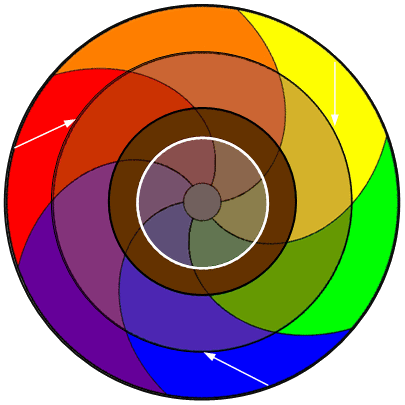
The colour wheel remains your foundational tool, divided into primary colours (red, yellow, blue), secondary colours (orange, green, purple), and tertiary colours that bridge the gaps between them. However, tattoo inks behave differently than paints or markers. According to the Smithsonian’s analysis of tattoo pigment chemistry, modern tattoo inks contain metal salts and organic compounds that interact with dermal tissue in ways that affect final colour outcomes.
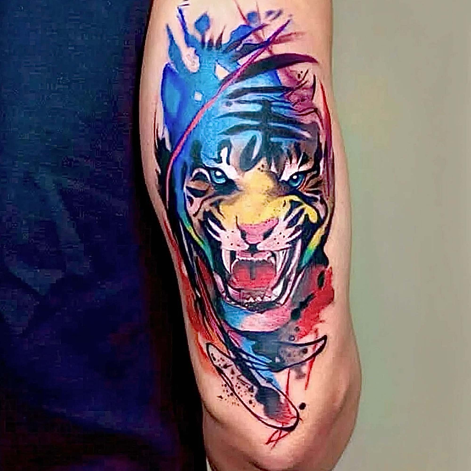
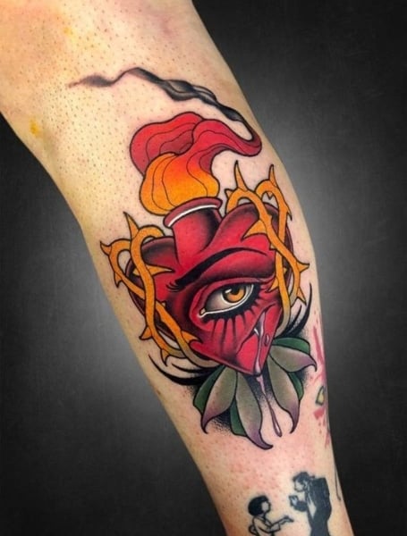
Understanding complementary colours—those opposite each other on the colour wheel—helps create visual contrast and depth. Red and green, blue and orange, yellow and purple: these pairings create dynamic tension that makes designs pop. Analogous colours, those adjacent on the wheel, create harmony and smooth transitions that work beautifully for realistic portraits and natural elements.
Primary, Secondary, and Tertiary Inks in Your Kit
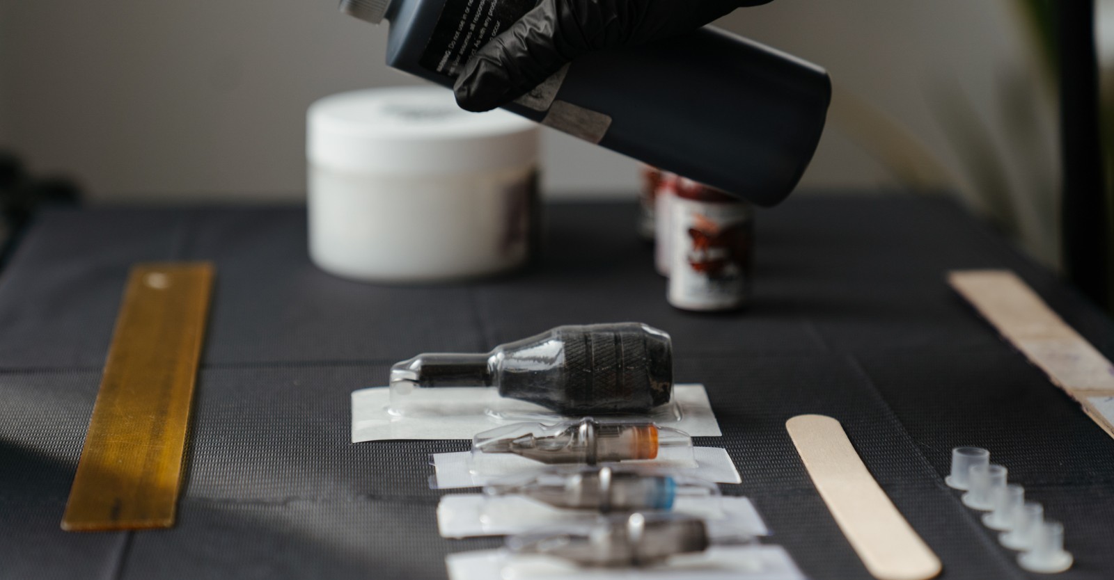
Building a professional ink collection requires strategic thinking. Start with high-quality primary colours from reputable manufacturers, as these become the foundation for mixing custom shades. Secondary colours can often be purchased pre-mixed for consistency, particularly when working with clients who return for multiple sessions where exact colour matching proves critical.
Your ink selection should account for both pure pigments and pre-diluted shades. Pure pigments offer maximum vibrancy and mixing flexibility, whilst pre-diluted inks provide consistency for common colours you use repeatedly. Many professional artists maintain 30-50 different ink colours in their regular rotation, though beginners can start with 15-20 essential shades.
How Skin Tone Affects Colour Selection
Perhaps the most crucial consideration in tattoo colour theory involves understanding how different skin tones alter the appearance of your chosen inks. This knowledge separates novice artists from true professionals and directly impacts client satisfaction.
Fair skin provides the most neutral canvas, allowing inks to appear closest to their true colour. However, this doesn’t mean all colours work equally well—pale skin shows every imperfection, making precise technique essential. Medium skin tones add warmth to cooler colours and can enhance earth tones beautifully, but require careful selection to ensure adequate contrast.
Darker skin tones present the most complex considerations. According to research published by dermatology experts at DermNet NZ, melanin concentration affects how light reflects through tattoo pigments, often warming cool colours and reducing the visibility of certain shades. This doesn’t limit your palette—it requires intelligent colour selection.
Choosing Inks for Different Skin Tones
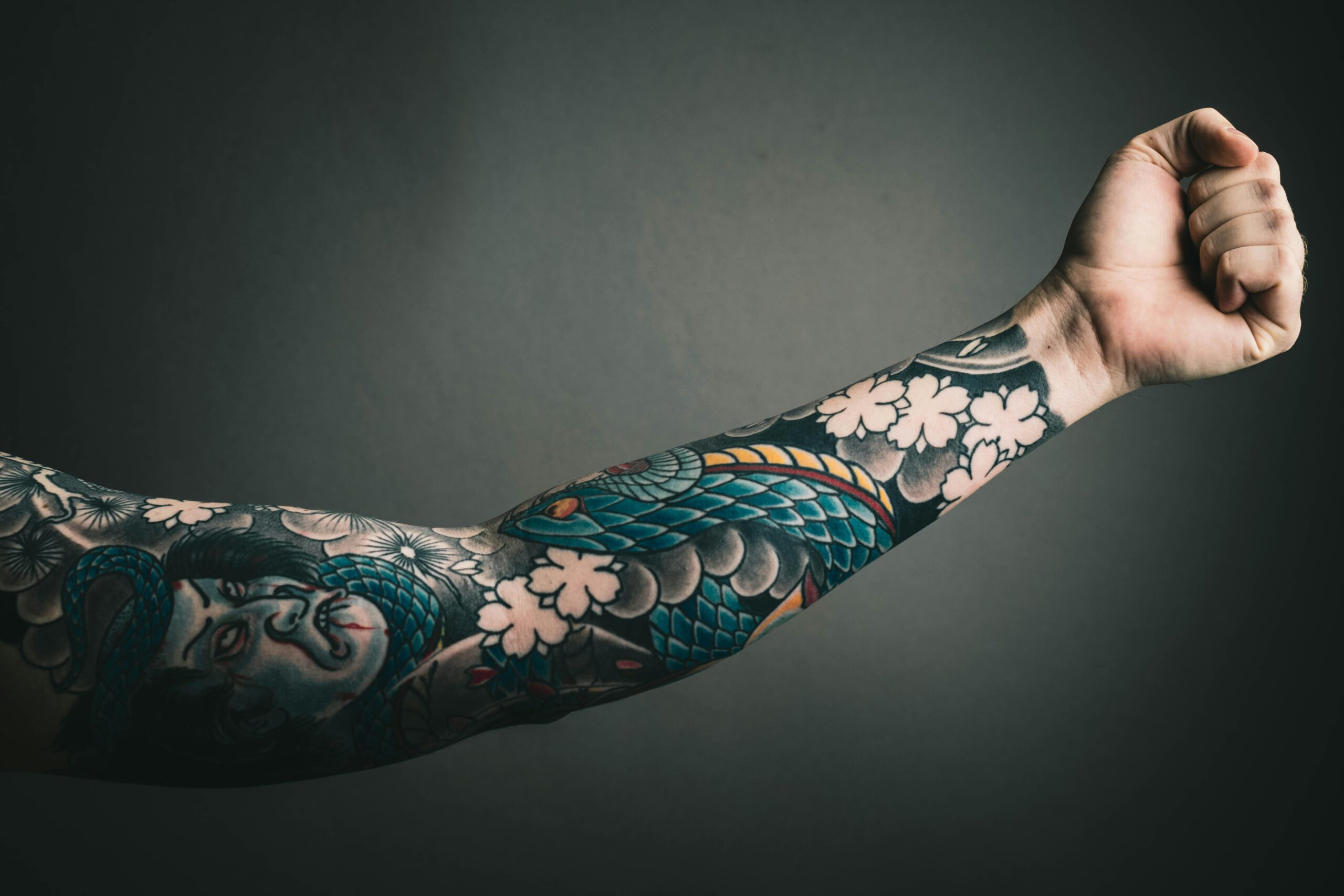
For clients with darker skin, prioritise highly saturated colours with strong pigment loads. White ink becomes nearly invisible, whilst pastel shades lose definition. Instead, focus on jewel tones: deep purples, rich blues, vibrant greens, and bold reds maintain visibility and age gracefully. Black work and contrast-heavy designs often provide the most striking results.
Golden undertones in olive skin respond beautifully to warm palettes—oranges, reds, and browns create natural harmony. Cool-toned fair skin showcases blues, purples, and greens with stunning clarity. Understanding these relationships allows you to recommend colours that will genuinely suit each client’s unique canvas.
Your fine line tattoo training teaches precision, but colour selection requires equal attention to achieve professional results that satisfy clients long-term.
Professional Ink Blending Techniques
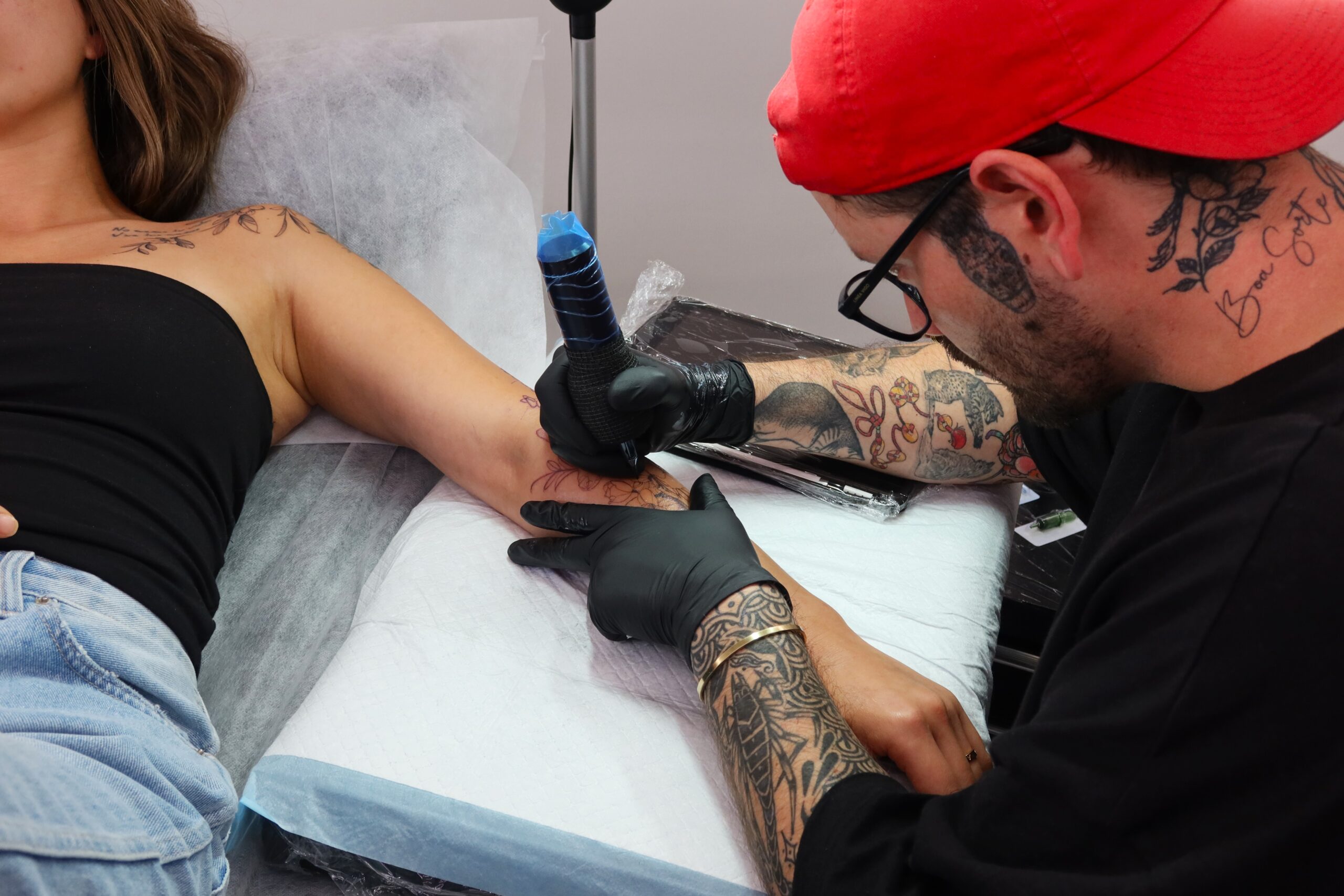
Successful colour blending in tattooing requires different techniques than traditional art mediums. You’re working with a living canvas where pigment sits beneath the skin’s surface, creating unique optical effects that demand specialised approaches.
The whip shading technique creates smooth gradients by gradually reducing needle pressure and speed whilst moving from saturated colour to lighter tones. This method works exceptionally well for dimensional effects in realistic tattoos. Stipple blending uses controlled dot patterns to transition between colours, creating texture whilst maintaining colour integrity—perfect for illustrative styles.
Colour packing involves saturating the skin with your base colour before introducing secondary tones, allowing you to build depth and complexity. This layering approach mirrors traditional painting but requires understanding how healed tattoos change appearance as the epidermis regenerates over your work.
The Science of Optical Mixing
Optical mixing occurs when the eye blends separate colours that sit close together, creating the illusion of a third colour without physically mixing inks. This technique proves invaluable when working with limited colour palettes or when certain ink combinations tend to muddy when directly mixed.
By placing small amounts of pure colours adjacent to each other, you create vibrant visual effects that maintain clarity even as tattoos age. This principle, used effectively by pointillist painters, translates beautifully to fine line tattoo work where precision placement allows for sophisticated colour interaction.
Common Colour Mixing Mistakes and Solutions
New tattoo artists frequently make predictable colour mixing errors that compromise their work’s quality. Understanding these pitfalls helps you avoid them as you develop your skills.
Over-mixing creates muddy, dull colours that lack vibrancy. When combining inks, mix just enough to achieve your desired shade, then test on practice skin before applying to clients. Remember that healed tattoos typically appear 20-30% lighter than fresh applications, requiring slightly more saturated colours than might initially seem necessary.
The “brown trap” catches many beginners—inadvertently creating brownish tones when attempting to darken colours. Instead of adding black to deepen a colour, use its complementary colour in small amounts. To darken red, add tiny amounts of green. To deepen blue, incorporate subtle orange tones. This maintains colour vibrancy whilst achieving depth.
According to colour theory research from the University of the Arts London, understanding pigment interaction prevents the chemical dulling that occurs when certain compounds combine, particularly relevant for tattoo inks containing different metal-based pigments.
Testing and Documentation
Professional artists maintain detailed records of successful colour combinations, including ratios, brand combinations, and client skin tone considerations. Create a reference book with healed tattoo photos showing how specific colour combinations age, noting which brands and ratios produced optimal results.
Testing new colour combinations on practice skin before client application remains non-negotiable. Artificial practice skin doesn’t perfectly replicate how inks heal in dermis, but provides crucial information about immediate colour interaction and saturation levels. Your online tattoo course training emphasises systematic testing protocols that prevent costly mistakes.
Creating Custom Colour Palettes for Client Designs
Developing custom colour palettes for each design demonstrates professionalism and elevates client satisfaction. This skill separates competent technicians from sought-after artists who command premium rates.
Start with your dominant colour—the primary shade that defines the tattoo’s character. Build around this anchor with supporting colours that enhance rather than compete. Consider the 60-30-10 rule borrowed from interior design: 60% dominant colour, 30% secondary colour, and 10% accent colour creates visual balance that reads clearly from a distance.
Seasonal colour theory applies beautifully to tattoo design. Spring palettes feature clear, warm colours with yellow undertones. Summer palettes emphasise soft, cool colours with blue undertones. Autumn palettes showcase rich, warm earth tones, whilst winter palettes feature bold, cool colours with high contrast. Matching colour schemes to client colouring creates instinctive visual harmony.
Temperature and Emotional Impact
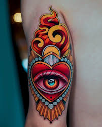
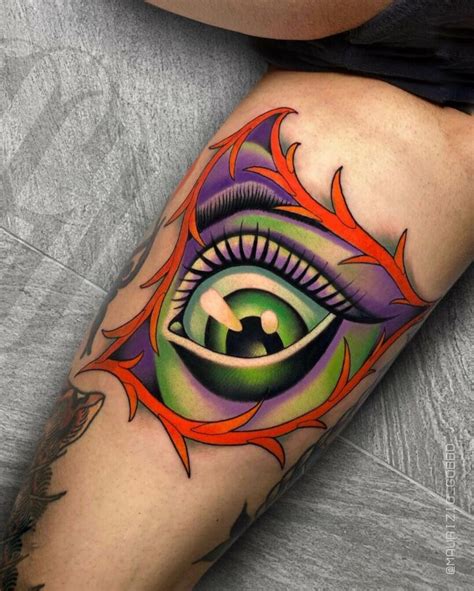
Warm colours (reds, oranges, yellows) advance visually and evoke energy, passion, and intensity. Cool colours (blues, greens, purples) recede and communicate calm, depth, and mystery. Strategic use of temperature creates dimension in your work, making certain elements pop whilst others provide background depth.
Understanding colour psychology helps you guide client decisions towards palettes that match their tattoo’s intended emotional impact. Memorial tattoos might benefit from cool, serene palettes, whilst celebration pieces often call for warm, vibrant combinations.
Advanced Colour Techniques: Saturation and Value Control
Mastering saturation and value separates good colour work from exceptional artistry. Saturation refers to colour intensity—highly saturated colours appear vivid and pure, whilst desaturated colours seem muted or greyish. Value describes lightness or darkness independent of hue.
Controlling both elements creates dimensional, professional tattoos. High saturation with varied values produces bold, graphic results perfect for traditional and neo-traditional styles. Moderate saturation with subtle value shifts creates the soft realism that characterises portrait work. Low saturation with strong value contrast delivers the sophisticated aesthetic popular in contemporary fine art tattooing.
The equipment you use significantly impacts your ability to control saturation and value. Quality machines with precise voltage control allow for the subtle adjustments that separate amateur work from professional results.
Building Your Professional Colour Ink Collection
Strategic ink investment accelerates your development as a colour tattoo artist. Start with a solid foundation of primary colours from a single, reputable manufacturer to ensure consistency in mixing. Add essential secondary colours, then gradually expand into specialty shades as your style develops.
Budget approximately $500-800 AUD for a professional starter colour collection covering basic needs. As you progress, invest in specialty inks for specific effects—UV reactive inks, pastel collections, or earth tone sets depending on your emerging style preferences.
Research brands thoroughly before committing. Different manufacturers use varying pigment bases that affect healing, longevity, and mixing compatibility. Many Australian artists favour brands like Eternal Ink, Intenze, or World Famous for their consistency and safety profiles, though personal preference varies.
Master Colour Theory Through Professional Training
Understanding colour theory intellectually differs vastly from applying these principles confidently with real clients. Professional training provides the structured practice and expert feedback necessary to develop true mastery.
At Omnia Tattoo Academy, our comprehensive courses include dedicated colour theory modules that move beyond basic concepts to practical application. You’ll work through systematic exercises building muscle memory for mixing, testing colour combinations on practice skin, and learning how different skin tones affect your colour choices.
Our experienced tutors provide personalised feedback on your colour work, helping you develop the sophisticated eye necessary for professional colour tattooing. With six days weekly tutor support and self-paced online learning, you’ll master colour theory at a speed that suits your schedule whilst building the portfolio pieces that demonstrate your capabilities to future clients.
Take the Next Step in Your Tattoo Career
Ready to transform your understanding of colour theory from basic concepts to professional application? Our comprehensive tattoo courses provide the structured training, professional feedback, and hands-on practice necessary to master colour work that captivates clients and builds your reputation.
Join Australian tattoo artists who’ve developed their skills through Omnia’s proven training methodology. With flexible payment plans starting at $40 per week, professional equipment included, and ongoing tutor support throughout your learning journey, you’ll gain the colour expertise that sets you apart in this competitive industry.
Explore our course options today and start creating the vibrant, professional colour work that builds successful tattoo careers.